Thursday, 21 January 2016

Editing the website

To edit the website we used wix which is a free website creating software. We had to create :


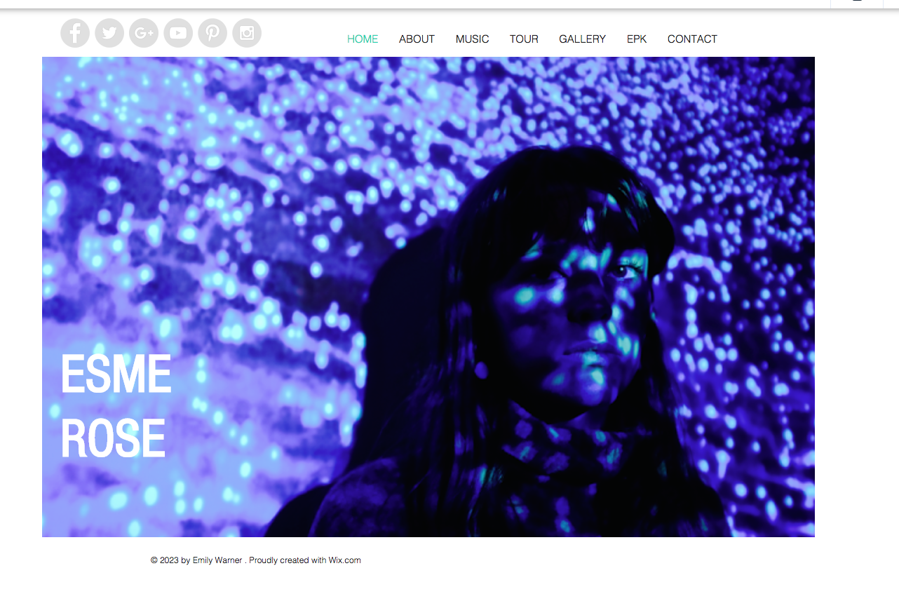
A HOMEPAGE: This showed a photo of her and was the first thing the audience saw with a clear title and link to social media pages.
ABOUT: This page has a some writing about the actual artist and some pictures to give the audience a sense of personality
MUSIC PAGE: This was to show the artists new music videos on youtube
TOUR: This was to show tour dates and link to buy tickets 
GALLERY: Photos of the artist 
EPK: information about the artist agent,website adress etc
CONTACT: email adresses and phone numbers for contacting the artist 


 This is the social media bar where we linked instagram and other social networking sites.


                    Here is a bar for changing and adding differnt things to the page for example text,image,gallery,shape,video etc...By clicking on the individual link you could then upload things through youtube and files. 


These tools are for adding different sorts of information for the layout of the website for example, downloading videos and photos or documents,or changing the layout,font colour.

We used these tools to add a picture of Esme rose our artist and then create a title of her name in white font where we then changed the gradient of the colour to be lighter against the blue background.


The 'About page' we inserted a photo that we took in a photo shoot and a big title to make it clear what the audience were looking at. We then added a quote using the textbox and some writing about her.


This bar was to undo mistakes on a page, save the work you had done, preview what it would look like and publish when all the work on the page was ready to go live.

  
This bar was to adjust size of font and position of where it was on the page. 


Overall we wanted a very plain website that had just a touch of edginess to suggest an alternative artist with the blue background aswell as making it easy for the audience to locate information. however we used a very basic layout to show the audience that the only thing we were promoting was our artist and her music and not something synthetic.

Editing the website photos

After taking the photos for the website on the same cameras we used for the album artwork because we wanted the style of the photo to link (the light of the film camera produces a certain effect) we began editing them. We chose a photo that was at a slight angle as we liked the way she wasn't directly facing the camera.  We then changed the colours,light and level of light on the photo to give it a more blue/purple dream theme that connect more with the colours in our music video

BEFORE - THE ORIGINAL PHOTO WE CHOSE


Editing the photo 
AFTER - THE PHOTO WE WILL USE FOR OUR WEBSITE


Photo shoot for website

This is the photo shoot for our website. Esme our artist stood in front of a projector on a white wall and we projected an image of blue plankton that has a sparkly effect that projected of her face as well. We used this image because we used similar bright colours in our video and on top of that it adds something special and interesting for the audience to look at instead of just photos as well as following the euphoric/dream theme. 


I am really pleased at the way in which these photos turned out as i think it is exactly how my group and i wanted these photos to look for our artist and the genre convention being alternative/indie music

Editing and improving our final album artwork

 
To begin the editing process we felt that this photo matched the front cover to much so we increased the brightness to fade the colours to make the background lighter.


I then increased the contrast by roughly 10 percent so that our artists features weren't lost in the lighter background.
I then placed a layer of white over the image to make the image appear less strong when next to the bold front cover of our album. I think this works as although is the same style of photo the edited version is a lot lighter making it interesting to look at and diverse from the other photos.
I then used the bump distortion tool to increase the size of her lips to add sexual connotation to interest the audience and make her more idealistic. 
I then used the blurring tool to remove the bags from her eyes to get rid of any blemishes so her face appeared perfect for the audience.

Wednesday, 20 January 2016

FINAL ALBUM ARTWORK DESIGN

FRONT COVER 
INSIDE LEFT COVER 
INSIDE RIGHT COVER 
BACK COVER 


Tuesday, 19 January 2016

Album artwork design draft 1 feedback

The front cover is to light, the artists name does not stand out at all, the writing needs to be darker and there is no album name therefore it does not look professional. 


The inside cover is a great photo however it is slightly out of focus and the colour grading isnt very storng so the artist blends in to the white background, tronger photos need to be taken which are properly edited to ensure that the audience can believe it looks liek a professional album artwork


The back cover colour grading is not clear enough, the writing is bland and each individual song name doesnt stand out so it does no engage an audience in a way that we want to attract our target audience.
This is a screenshot of a moving slow motion shot therefore
it is very grainy and out of focus, this shot needs to be replaced completely however the close up fits the indie music genre conventions of only seeing the artist.

Feedback for 2nd album artwork draft

Here is my feedback for my second album artwork design:

Front cover


The colour saturation and contrast needs to be changed so that the black outlines were stronger otherwise the light and shade would blur in together and her features would not stand out.


Looking at conventions of other similar genre and their albums, we needed and album name rather than a self titled album otherwise it will not look real, for example below is a real album cover that has the name of the artist aswell as the name of the album.


Back cover 


The list needed numbering, there also needs to be the legal information as well as a barcode to make it look like a real album cover like in Ellie Gouldings  album cover below:


Album Artwork design draft 2