This is my Evaluation Task 1 using slide share focusing specifically on conventions of genre comparing my main product which is my music video (The big Unknown by Elder Island ) as well as ancillary texts to other products that belong to existing artists such as biddy, florence and the machine and daughter.
TECHNICAL CONVENTIONS USED: panning shots,slow motion shots, close up shots of artist,
SYMBOLIC CONVENTIONS USED: basic set, white costume (dream theme), sparkly make up,
Here is my presentation:
Full transcript from presentation:
1. Evaluation Task 1 By Izella Oxenham
2. Introduction to conventions Conventions are stereotypical signs of something that is recognised. For example technical conventions include camera work, editing and anything using technology. Another type of convention is symbolicconventions. Symbolic conventions use colours or any symbol that represents a certain thing. For example the colour red symbolises love and passion and a knife symbolises cruelty and death Genre however means a particular category of something eg music, for example pop music usually includes a lot of colour however our genre which is indie/ alternative uses less colour and design elements and focuses more on the artist. Conventions are used to let an audience recognise and consume something.
3. Music Video Set Design The Big Unknown – Elder Island The set design for my music video was extremely simple. Our set was a combination of blue lighting and a plain black background. However we had silk and chiffon white fabric hanging down to add something and link to the dream theme of our music video.
4. Music Video You’ve got the love – Florence and the machine Youth – Daughter The video for You’ve got the love is very similar to mine as the set is made up of a black background with cold blue/white lighting. This shows that for my music video my group and I chose to develop the conventions of an indie music video. The simpler the set the more the audience can focus on the artist. Again the set in the music video for Youth is very similar to the big unknown because there is no set, it is just a black background that uses a lot of white light, particularly spot light to promote Richard Dyers star theory that the audiences attention should be focused completely on the artist and nothing else. The colour scheme is also very simple just black and white this could connote that the artist has two sides to her music a dark and light side.
5. Music Video Performance This screenshot was taken from my music video focusing on the element of performance. Our artist is looking directly in to the camera showing Richard dyers star theory that she involving and connecting with the audience. The Big Unkown
6. Music Video Performance You’ve got the love – Florence and the Machine Youth – Daughter In the music video youth, this screenshot shows a close up of the artists face and her looking in to the camera to connect with the audience, this shows that our music video is developing the conventions of an indie music video by involving this element. In the music video You’ve got the love, it is almost exactly the same as my music video because it is a close up of the artists face however on a slight angle. Both artists are looking in to the camera which encourages dyers star theory as it creates a ‘synthetic’ image as the artist is not ignoring the audience but can acknowledge they are there.
7. Music Video Make Up The Big Unkown For the make up conventions in our music video, as the set was so simple we wanted the make up to stand out a lot, so while keeping her face up relatively simple we made her eyes stand out so that when she was incorporating the performance element and staring directly in to the camera the audience would recognise and engage.
8. Music Video Make up You’ve got Love – Florence and the machine Youth –Daughter For the video for you’ve got the love, the artist is wearing very basic face make up and then to contrast this wearing sparkly/ silver eye shadow. This follows the colour scheme used in the video as the lighting is white / silver as well as her sparkly costume. Our video therefore develops the media conventions as although the set and dress were white, the blue/ green lighting was replicated through her make up as well. The make up for the video youth, is completely different to ours as they have continued with there black and white theme therefore wearing nearly no make up. Our video compared to youth is going against genre conventions for an indie music video because we aren't keeping it strictly plain and simple but adding different colours and bolder colours which are noticeable for the audience, where as youth want the audience to focus more on the artist rather then the colours of her make up giving her a much more organic image.
9. Music VideoCostume The Big Unknown The costume for our music video was very plain and simple, a long white flowy dress that related to the white fabric hanging from the ceiling in the set. We chose this so that when she was performing amongst the fabric they would work together and blend in making her stand out. This promotes Richard Dyers star theory that we are concentrating more on the artist and her performance rather then the costume.
10. Music Video Costume Youth – Daughter You’ve got the love – Florence and the machine The costume for you’ve got the love is similar to our white dress and white set as the silvery / sparkly dress matches part of the set and the lighting. However the costume in you’ve got the love is still bold therefore distracts the audience away from the artists performance slightly going against typical genre conventions for an indie music video However the video for youth is developing the genre conventions for an indie music genre. The costume is plain and simple using black and grey which matches there set and there is no distraction what so ever therefore the audience can focus on nothing but the artist as the performance is what is important.
11. Music Video Camera Work The Big Unknown We used a variety of different shots to capture every angle of our artist. Most of these included mid shots and close ups to show her face to the audience as much as possible however this screenshot shows a slow motion pan around her to capture every angle in one shot. This makes sure that the majority on the artist making it about there performance rather then having most of the set/background in the shot.
12. Music Video Youth- Daughter You’ve got the love – Florence and the machine Camera Work In the music video for youth the same pan in our video reveals the drummer as if it is a new emerging artist which fit the conventions for an indie band. This is similar to our video as the panning shows every inch of the band and set. Although the video for you’ve got the love is showing more of the set then the artist it is still the same pan and shot as our video showing the detail of the performance more then anything else. Once again this is promoting Richard Dyers star theory that the artist is the most important thing by use of camera work.
13. Music Video Editing The Big Unknown In our video we used many effects in the editing process. This screenshot of the end of our video shows a cross dissolve . We chose this to add in post production to use a close up of our artist and make her face fade away slowly leaving the image of her face which has been promoted a lot in the video as the last image in the audiences mind.
14. Music Video You’ve got the Love – Florence and the machine Youth – Daughter Editing In the music video for you’ve got the the love there is a sparkly shimmer used as an after effect added at the end of the video. This connects with the over all sparkly/ white colour theme used throughout. This is going against genre conventions for an indie music video as they are not ending the video on her face like our video to show how important she is but instead focusing on a design element. However in youth they use a cross fade to black which in the same way as our video leaves the audience with an image of the band before it goes black which is developing the genre convention of an indie/ alternative music video.
15. Album Artwork –THE BIG UNKOWN FRONT BACK The album artwork for our artist is very plain and simple as we wanted to develop the conventions of an indie music artist and make it more about the artist rather then the design elements. We chose a black and white colour scheme, therefore taking the photos in black and white. This adds contrast to the album artwork engaging the audience as soon as they look at it. The photo shows our artist is young/ attractive /indie, enforcing the idea she is new and emerging that will interest the audience. The pictures have a vintage feel as they were taken on a film camera which gives our artist a rustic original image. The font is bold and clear revealing the important information eg the title of the album and list of songs. The white writing on the front contrasts well with the black/grey background. The artists name is more bigger then the title of the album as we want her name to be the most important thing and what the audience see first.
16. Album Artwork –THE BIG UNKOWN The back cover links to the front as they both have a nature theme taken outside in a forest area, which promotes the naturalism of our artist and promotes Richard Dyers star theory of an organic image. The grey /black colours contrast well to the front cover adding a slight edge in reference to an indie artist. The font same as the front yet in black stands out but doesn’t over rule the more important writing on the front as well as the list of songs that aren’t numbered to keep it as simple as possible. We added a barcode and legal information at the bottom of the back cover to make the album look more professional yet also keeping the more independent indie artist theme that looks natural.
17. Album Artwork – FLORENCE AND THE MACHINEFRONT BACK The album artwork promoting Florence and the machine is very similar to ours. The colour scheme is the same simple black and white to show contrast although for this album the background is white and the font is black. This could suggest two sides to this artists music adding an extra interest for the audience.
18. Album Artwork – FLORENCE AND THE MACHINE Our two artists are in very similar positions, Esme rose is crossing her arms and is positioned on the right side of the photo, and Florence has her arm resting under her chin slightly to the left of the photo, this shows an organic image for both artists as they are not directly in front of the camera which looks referring to Richard dyers star theory like a synthetic image that is fake and computerised. The font is slightly more complex then ours as each letter is a different size and shape. It is a more personalised title that shows the consumer Florence has a personality where as ours is simple and clear which goes against being represented as an indie artist. The back cover is even simpler showing a photo in the same colour scheme of Florence the artist in the same position just a tiny difference. This is completely different to ours as although we wanted Esme looking natural on the front we wanted to add a nature theme to make the genre conventions extremely clear. Our barcode is much bigger and clearer on our back cover compared to Florence this could show that Florence's album back cover is less professional and more personalised like she is completely connected to the album artwork linking with the font on the front. This shows the even more minimalistic approach that this artists album portrays developing the genre conventions of an indie album cover that the artist is involved in a simple yet effective way.
19. Album Artwork – BIRDY FRONT BACK Esme Rose and Birdy’s album artwork is also very similar to the previous. The colour scheme for the front is also black and white showing versatility and also making certain things stand out for the consumer. The back cover is a light cream, this is so the front cover can stand out next to it.
20. Album Artwork – BIRDY I have done the exact same thing for my artist by using a dull grey/ black to dull down the back cover so the front can be bolder and more appealing. The photo of birdy on the front is very similar to ours as she is wearing clothes that are of an indie genre like the fur coat esme rose is wearing. It is also a photo taken outside in a field which is a natural environment just like the front of our album artwork that connotes the artists as being natural and down to earth. The font is black and clear just like in our album artwork however on birdy's there are no lines joing the letters but dots as this is something different it seems personalised and different which work developing the conventions of indie genre music. The size of the photo also matches the size of our album photo showing the artists are the most important thing. The back cover is different to our album as there is no connection of nature on the back just a light colour which is plain and simple making the audience focus on the songs rather then the theme. However both back covers develop the conventions of an indie music genre because they are both symbolising an organic image for example the picture of the woods is a natural environment and the plain colouring seems personalised and linked to the artist where it is not trying to be over the top using lots of design elements.
21. My Website HOME PAGE The conventions for our homepage develop the conventions of an indie music genre as they have the simple layout,font and colours however add something a little bit different that no one else has. For example we have used a black and white colour scheme, this holds contrast and intrigues the audience as it is simple yet classic. The font is square and clear. However the main blue sparkly image is what adds something different as it catches the audience attention straight away and links to our music video using the same blues/ purples as the lighting. The picture placement is the largest thing on the cover showing our artist is most important. The photo of her shows her looking slightly away from the camera showing she is down to earth and according to Richard Dyers star theory it is not a synthetic image but capturing something natural which connects the audience to her in a perosnal way.
22. My website Tour Gallery Music About For the rest of the website we have used the same black and white colour scheme with simple font that is clear and can easily guide the audience to the information they need about the artist. The titles are placed in the centre to make it easier to see what you are looking at. The black and white photos also link to the album artwork so that the audience can link the media they are consuming to the artist. There is not much writing about the artist only one main paragraph with a quote on the ‘about’ page to keep it personal and connect the audience to the artist which again is promoting Dyers star theory that our artist is ‘organic’. We are also not only following the conventions of an indie music artist but changing and making them better. On every page of the website the placement of the photos is always in the middle and the largest thing on the page to show she is the most important thing and nothing else. The gallery of photos is going against the conventions of an indie artist as all the photos are looking directly in to the camera making her look slightly synthetic however we felt it was important to promote more then just her music so her modelling adds another layer of interest for the audience and her as an artist is always more important then photos. Her new song on her album is also dedicated to one whole page as well as a whole list of tour dates to promote her as up and coming which follows the conventions of an indie music artist. The social media links are in a bar at the top however they are in a faint grey colour to resemble although she has them her music is more important and wants the audience to be more
23. Website – BIRDY On Birdy’s website homepage in the same way as our website there is a huge photo of her as the background and she is not looking in to the camera promoting the natural image and following the genre conventions of an indie artist. There is also a gallery and not just of her showing she is a down to earth artist and following indie genre conventions as there are photos of nature which makes her seem natural and an ‘organic’ artist. (Richard Dyers star theory).The colours are challenging indie genre conventions as usually black and white makes it simple like on our website although birdy’s font is the same there is a huge amount of colour that is normally used when promoting a pop artist. However the font for the layout flowery/ feminine which looks personalised which adds to her natural image. In the same way as our website birdy follow genre conventions for an indie artist as her social media tab is also small and on the right hand side where it is less noticeable making her music and her the most important thing rather then unreal social media accounts.
24. Website – BIRDY MusicTour Videos Birdy's tour dates, similar to our artist are bold and placed on the page as a large image right in the middle symbolising important information. The black and white theme that we use also adds a nice contrast however it is simple and effective. Her video of her recording a live acoustic session reinforces her natural/organic image as it seems real for her audience that her music is real and not fake. She also shows her songs on sound cloud, sound cloud is a popular website used for up and coming artists this shows her audience she does not need to use the most fancy looking website but one that really shows her music. This all supports the conventions showing she is an indie music artist which holds similar conventions to our artists website.
25. Website- FLORENCE AND THE MACHINEHomepage The homepage for Florence and the machines website follows indie conventions because she uses a gallery of gifs that move with no sound this shows she is a real person and her illusion is not fake, there is also no writing is all about the artist which takes up the whole page reinforcing the importance This is similar to our large blue photo on our website. The dark colours also support the indie genre
26. Website- FLORENCE AND THE MACHINENew album release Tour dates Selection of albums Tours/festivals On her main website aside from the homepage there is a huge picture of her new album and lots of pictures cut up in to a photo collage. This has a very edgy theme, Her tour dates are also in black and white and use the photo from her album artwork which is the same as our website. It is plain and easy to see the information is bold and clear. This is developing the conventions for an indie music artist. However her selection of albums and festivals tour dates are very bold using lots of colour and it is all crammed together on a page. This is completely challenging the conventions of an indie music artist as it is more a pop style and completely contrasts to the rest of the website. It is almost like a scroll of everything about her which in some ways is an interesting effect for the audience as they feel like they are scrolling through her personal information like a perosnal blog which connects them more to the artist.
This is our Evaluation Task 2, focusing on our main product which was our music video and how this compared to our ancillary texts. We also discussed how all three of our products link together and promote each other specifically looking at theories: Richard dyer and Richard Neegus's star theory.
FINAL REFLECTION OF OUR CAMPAIGN
In reflection and looking back at how all the three products link we purposefully wanted our music campaign to be individual just like our artist so we would engage a different type of audience that is separate from the ordinary. Applying Richard Dyers star theory we intentionally made our artist extremely accessible to her audience so that they felt they could relate to her music and look up to her as a star and referring to Richard Neegus theory created a organic image for our artist as clearly music is the most important thing and that is what our target audience would be interested instead of a fake image where they feel they can not connect in any way. However there are particular moments where she appears synthetic for example when she stares directly in the camera but that is just a stereotype and we felt our artist should make direct contact with the camera to make the audience feel special and connected with her. In the music video which is our main product, the dream theme allows the audience to be transported to a world which they only share with our artist which connects them in a special way and the slow motion shots where she is not staring in to the camera capture her in her element. The album artwork is set outside in a natural environment with natural colours such as grey, white and black to suggest she is completely organic and her music is what is important and the photos aren't posed but are taken naturally like she doesn't know they have been taken. The website again uses a dream theme with a blue sparkly background with a main photo of her at an angle and placed not in the middle of the screen which suggest edginess and and indie artist. Overall i think the three products work very well together as they all show she is an organic artist true to her music with an edgy dream theme that separates her from other artist however i feel the album artwork could have been less natural and had more of a dream theme instead of plain black and white to fit the is more.
This is my evaluation task 3. I used prezi to explore the process from presenting my initial ideas of a music video to the class and to our executive producer and then how i developed my ideas within my group from feedback. I also show the process of how the feedback from the ancillary texts and rough cut of the music video developed my ideas and made them much better using questionnaires and live recording for the feedback. Overall there would be no overall product without feedback as it helps combine and adapt ideas to construct a product.
1.How did you gather your audience feedback? what methods did you use? present your stats and feedback from questionnaire and focus groups?
We gathered our audience feedback through filming a focus group we had organised previously cutting the video and then uploading it to you tube. We also used questionnaires and recorded the live feedback written on a blog post.
The full tasks and feedback throughout the term and along with the final focus group can be found on (evaluation task 3 prezi)
How did the demographic or physchographic profile of your audience affect the kinds of readings produced
DEMOGRAPHIC- Gender, Age, Race,Job (JICNAR SCALE)
PHYSCOGRAPHIC - Beliefs,faith and views (Vals and Teenage vals)
We chose our demographic audience to be both male and female though they were of the same age as we wanted a wider audience. However the Physcogrpahic audience were able to relate closely to the music video as they were all of the same social clique therefore enjoying and appreciating the video.
The effect this had on our feedback meant that our audience reacted much more positively then having a completely different target audience such as a group of 40 year old males.
What were the disadvantages /advantages to using these sources?/how reliable was the information in the key points used
ADVANTAGES:
We had a wide audience
It was a combination of both genders
It was our specific target audience
DISADVANTAGES
We knew some of our target audience therefore they could of been biased
Most of the audience were also making music videos therefore it is possible they were slightly prejudice to giving good feedback and it would of been better if we had an audience we didn't know.
What strengths did the feedback indicate in your music video?
Although there was no narrative the artistic devices made the video flow well and was very interesting
the three different artistic elements helped keep the audience engaged
We specifically chose the colours white blue and pink to give a euphoric/dream theme.An example of some feedback 'the colours in the music video portray the dream theme in a clear and artistic way'.
Another example of feedback we received which was positive was 'The shots in the music video make the artist appear interesting and attractive' this was very positive feedback as our artist is of the indie genre we wanted the audience to feel like they could look up to her.
What weaknesses did the feedback indicate in your music video?
Because it was all artistic and there was absolutely no narrative some of the audience felt times were slightly repetitive ' although the video flows well i find that the video can be slightly repetitive'. The point of our video was to be just artistic so the audience could focus on our artist and to a storyline however perhaps a fourth element would of engaged them more.
Another piece of feedback that we received was 'one of the shots you could see the back of the studio and that ruins the dream theme'. In development of this we removed the shot and replaced it to improve our product.
Explain the encoding/decoding model in relation to your audience feedback.
Our target audience decoded our product and some decoded it an unexpected way from our text for example the album artwork was meant to show a natural organic environment which reflects on our artist however the target audience felt it reflected an urban environment which was trendy and cool. There way of consuming the text is responsible to a different upbringing or way of thinking.
Apply the use an gratification theory to your responses? And how did our video illustarte this model in action ?
This is the model for use and gratification theory.
The way in which it applies to our target audience is that our audience were actively engaged. 'DIVERSION' helped our audience escape from even day problems and allowed themselves to be transported to another world which they connect with our artist which allows them to look up and respect her which we also used in our video.
Conclusion
It has been important for us to gain research into audiences of our product and also get feedback to create our artist as without the audience there would be no product. The online media is transforming the way audiences engage with media texts to a deeper level which means the audience is crucial to create a product as there involvement is what makes the product successful.
This is my Evaluation Task 4 using prezi looking at my main product which is my music video 'The big unknown' by Elder island and the ancillary texts which support it in the pre production / production and post production of my coursework.
To edit the website we used wix which is a free website creating software. We had to create :
A HOMEPAGE: This showed a photo of her and was the first thing the audience saw with a clear title and link to social media pages. ABOUT: This page has a some writing about the actual artist and some pictures to give the audience a sense of personality MUSIC PAGE: This was to show the artists new music videos on youtube TOUR: This was to show tour dates and link to buy tickets GALLERY: Photos of the artist EPK: information about the artist agent,website adress etc CONTACT: email adresses and phone numbers for contacting the artist
This is the social media bar where we linked instagram and other social networking sites.
Here is a bar for changing and adding differnt things to the page for example text,image,gallery,shape,video etc...By clicking on the individual link you could then upload things through youtube and files.
These tools are for adding different sorts of information for the layout of the website for example, downloading videos and photos or documents,or changing the layout,font colour.
We used these tools to add a picture of Esme rose our artist and then create a title of her name in white font where we then changed the gradient of the colour to be lighter against the blue background.
The 'About page' we inserted a photo that we took in a photo shoot and a big title to make it clear what the audience were looking at. We then added a quote using the textbox and some writing about her.
This bar was to undo mistakes on a page, save the work you had done, preview what it would look like and publish when all the work on the page was ready to go live.
This bar was to adjust size of font and position of where it was on the page.
Overall we wanted a very plain website that had just a touch of edginess to suggest an alternative artist with the blue background aswell as making it easy for the audience to locate information. however we used a very basic layout to show the audience that the only thing we were promoting was our artist and her music and not something synthetic.
After taking the photos for the website on the same cameras we used for the album artwork because we wanted the style of the photo to link (the light of the film camera produces a certain effect) we began editing them. We chose a photo that was at a slight angle as we liked the way she wasn't directly facing the camera. We then changed the colours,light and level of light on the photo to give it a more blue/purple dream theme that connect more with the colours in our music video
This is the photo shoot for our website. Esme our artist stood in front of a projector on a white wall and we projected an image of blue plankton that has a sparkly effect that projected of her face as well. We used this image because we used similar bright colours in our video and on top of that it adds something special and interesting for the audience to look at instead of just photos as well as following the euphoric/dream theme.
I am really pleased at the way in which these photos turned out as i think it is exactly how my group and i wanted these photos to look for our artist and the genre convention being alternative/indie music
To begin the editing process we felt that this photo matched the front cover to much so we increased the brightness to fade the colours to make the background lighter.
I then increased the contrast by roughly 10 percent so that our artists features weren't lost in the lighter background.
I then placed a layer of white over the image to make the image appear less strong when next to the bold front cover of our album. I think this works as although is the same style of photo the edited version is a lot lighter making it interesting to look at and diverse from the other photos.
I then used the bump distortion tool to increase the size of her lips to add sexual connotation to interest the audience and make her more idealistic.
I then used the blurring tool to remove the bags from her eyes to get rid of any blemishes so her face appeared perfect for the audience.
The front cover is to light, the artists name does not stand out at all, the writing needs to be darker and there is no album name therefore it does not look professional.
The inside cover is a great photo however it is slightly out of focus and the colour grading isnt very storng so the artist blends in to the white background, tronger photos need to be taken which are properly edited to ensure that the audience can believe it looks liek a professional album artwork
The back cover colour grading is not clear enough, the writing is bland and each individual song name doesnt stand out so it does no engage an audience in a way that we want to attract our target audience.
This is a screenshot of a moving slow motion shot therefore it is very grainy and out of focus, this shot needs to be replaced completely however the close up fits the indie music genre conventions of only seeing the artist.


 Here is a bar for changing and adding differnt things to the page for example text,image,gallery,shape,video etc...By clicking on the individual link you could then upload things through youtube and files.
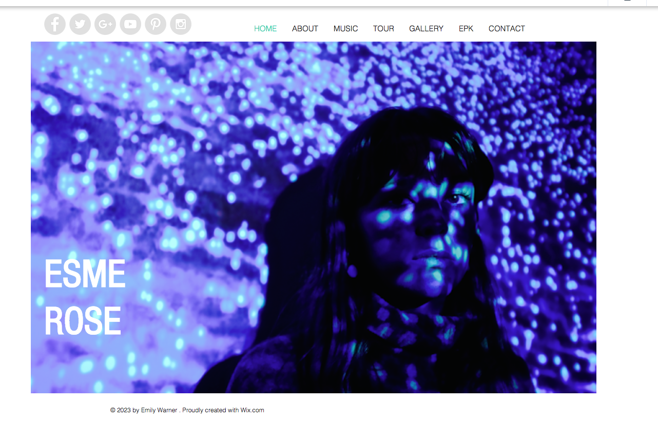


