This is our Evaluation Task 2, focusing on our main product which was our music video and how this compared to our ancillary texts. We also discussed how all three of our products link together and promote each other specifically looking at theories: Richard dyer and Richard Neegus's star theory.
FINAL REFLECTION OF OUR CAMPAIGN
In reflection and looking back at how all the three products link we purposefully wanted our music campaign to be individual just like our artist so we would engage a different type of audience that is separate from the ordinary. Applying Richard Dyers star theory we intentionally made our artist extremely accessible to her audience so that they felt they could relate to her music and look up to her as a star and referring to Richard Neegus theory created a organic image for our artist as clearly music is the most important thing and that is what our target audience would be interested instead of a fake image where they feel they can not connect in any way. However there are particular moments where she appears synthetic for example when she stares directly in the camera but that is just a stereotype and we felt our artist should make direct contact with the camera to make the audience feel special and connected with her. In the music video which is our main product, the dream theme allows the audience to be transported to a world which they only share with our artist which connects them in a special way and the slow motion shots where she is not staring in to the camera capture her in her element. The album artwork is set outside in a natural environment with natural colours such as grey, white and black to suggest she is completely organic and her music is what is important and the photos aren't posed but are taken naturally like she doesn't know they have been taken. The website again uses a dream theme with a blue sparkly background with a main photo of her at an angle and placed not in the middle of the screen which suggest edginess and and indie artist. Overall i think the three products work very well together as they all show she is an organic artist true to her music with an edgy dream theme that separates her from other artist however i feel the album artwork could have been less natural and had more of a dream theme instead of plain black and white to fit the is more.
Monday, 29 February 2016

Tuesday, 9 February 2016
3.(PART 1) What have your learned from your audience feedback?
This is my evaluation task 3. I used prezi to explore the process from presenting my initial ideas of a music video to the class and to our executive producer and then how i developed my ideas within my group from feedback. I also show the process of how the feedback from the ancillary texts and rough cut of the music video developed my ideas and made them much better using questionnaires and live recording for the feedback. Overall there would be no overall product without feedback as it helps combine and adapt ideas to construct a product.
3.(PART 2) What have you learned from your audience feedback?
1.How did you gather your audience feedback? what methods did you use? present your stats and feedback from questionnaire and focus groups?
- We gathered our audience feedback through filming a focus group we had organised previously cutting the video and then uploading it to you tube. We also used questionnaires and recorded the live feedback written on a blog post.
- The full tasks and feedback throughout the term and along with the final focus group can be found on (evaluation task 3 prezi)

- How did the demographic or physchographic profile of your audience affect the kinds of readings produced
- DEMOGRAPHIC- Gender, Age, Race,Job (JICNAR SCALE)
- PHYSCOGRAPHIC - Beliefs,faith and views (Vals and Teenage vals)
- We chose our demographic audience to be both male and female though they were of the same age as we wanted a wider audience. However the Physcogrpahic audience were able to relate closely to the music video as they were all of the same social clique therefore enjoying and appreciating the video.
- The effect this had on our feedback meant that our audience reacted much more positively then having a completely different target audience such as a group of 40 year old males.
- What were the disadvantages /advantages to using these sources?/how reliable was the information in the key points used
- ADVANTAGES:
- We had a wide audience
- It was a combination of both genders
- It was our specific target audience
- DISADVANTAGES
- We knew some of our target audience therefore they could of been biased
- Most of the audience were also making music videos therefore it is possible they were slightly prejudice to giving good feedback and it would of been better if we had an audience we didn't know.
- Although there was no narrative the artistic devices made the video flow well and was very interesting
- the three different artistic elements helped keep the audience engaged
- We specifically chose the colours white blue and pink to give a euphoric/dream theme.An example of some feedback 'the colours in the music video portray the dream theme in a clear and artistic way'.
- Another example of feedback we received which was positive was 'The shots in the music video make the artist appear interesting and attractive' this was very positive feedback as our artist is of the indie genre we wanted the audience to feel like they could look up to her.
- Because it was all artistic and there was absolutely no narrative some of the audience felt times were slightly repetitive ' although the video flows well i find that the video can be slightly repetitive'. The point of our video was to be just artistic so the audience could focus on our artist and to a storyline however perhaps a fourth element would of engaged them more.
Explain the encoding/decoding model in relation to your audience feedback.

- Our target audience decoded our product and some decoded it an unexpected way from our text for example the album artwork was meant to show a natural organic environment which reflects on our artist however the target audience felt it reflected an urban environment which was trendy and cool. There way of consuming the text is responsible to a different upbringing or way of thinking.
Apply the use an gratification theory to your responses? And how did our video illustarte this model in action ?


- This is the model for use and gratification theory.
- The way in which it applies to our target audience is that our audience were actively engaged. 'DIVERSION' helped our audience escape from even day problems and allowed themselves to be transported to another world which they connect with our artist which allows them to look up and respect her which we also used in our video.
Conclusion
It has been important for us to gain research into audiences of our product and also get feedback to create our artist as without the audience there would be no product. The online media is transforming the way audiences engage with media texts to a deeper level which means the audience is crucial to create a product as there involvement is what makes the product successful.
Monday, 8 February 2016
4.How did you use media technologies in the construction and research, planning and evaluation stages?
This is my Evaluation Task 4 using prezi looking at my main product which is my music video 'The big unknown' by Elder island and the ancillary texts which support it in the pre production / production and post production of my coursework.
Thursday, 21 January 2016
Editing the website
To edit the website we used wix which is a free website creating software. We had to create :

A HOMEPAGE: This showed a photo of her and was the first thing the audience saw with a clear title and link to social media pages.
ABOUT: This page has a some writing about the actual artist and some pictures to give the audience a sense of personality
MUSIC PAGE: This was to show the artists new music videos on youtube
TOUR: This was to show tour dates and link to buy tickets
GALLERY: Photos of the artist
EPK: information about the artist agent,website adress etc
CONTACT: email adresses and phone numbers for contacting the artist

This is the social media bar where we linked instagram and other social networking sites.

 Here is a bar for changing and adding differnt things to the page for example text,image,gallery,shape,video etc...By clicking on the individual link you could then upload things through youtube and files.
These tools are for adding different sorts of information for the layout of the website for example, downloading videos and photos or documents,or changing the layout,font colour.
We used these tools to add a picture of Esme rose our artist and then create a title of her name in white font where we then changed the gradient of the colour to be lighter against the blue background.


The 'About page' we inserted a photo that we took in a photo shoot and a big title to make it clear what the audience were looking at. We then added a quote using the textbox and some writing about her.

This bar was to undo mistakes on a page, save the work you had done, preview what it would look like and publish when all the work on the page was ready to go live.
This bar was to adjust size of font and position of where it was on the page.
Overall we wanted a very plain website that had just a touch of edginess to suggest an alternative artist with the blue background aswell as making it easy for the audience to locate information. however we used a very basic layout to show the audience that the only thing we were promoting was our artist and her music and not something synthetic.

A HOMEPAGE: This showed a photo of her and was the first thing the audience saw with a clear title and link to social media pages.
ABOUT: This page has a some writing about the actual artist and some pictures to give the audience a sense of personality
MUSIC PAGE: This was to show the artists new music videos on youtube
TOUR: This was to show tour dates and link to buy tickets
GALLERY: Photos of the artist
EPK: information about the artist agent,website adress etc
CONTACT: email adresses and phone numbers for contacting the artist

This is the social media bar where we linked instagram and other social networking sites.
 Here is a bar for changing and adding differnt things to the page for example text,image,gallery,shape,video etc...By clicking on the individual link you could then upload things through youtube and files.
 These tools are for adding different sorts of information for the layout of the website for example, downloading videos and photos or documents,or changing the layout,font colour.
We used these tools to add a picture of Esme rose our artist and then create a title of her name in white font where we then changed the gradient of the colour to be lighter against the blue background.
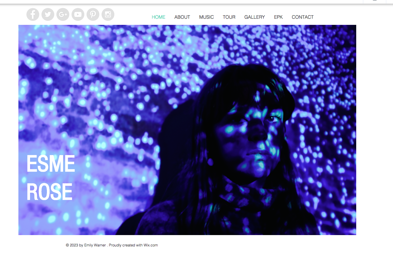

The 'About page' we inserted a photo that we took in a photo shoot and a big title to make it clear what the audience were looking at. We then added a quote using the textbox and some writing about her.

This bar was to undo mistakes on a page, save the work you had done, preview what it would look like and publish when all the work on the page was ready to go live.
This bar was to adjust size of font and position of where it was on the page.

Overall we wanted a very plain website that had just a touch of edginess to suggest an alternative artist with the blue background aswell as making it easy for the audience to locate information. however we used a very basic layout to show the audience that the only thing we were promoting was our artist and her music and not something synthetic.
Editing the website photos
After taking the photos for the website on the same cameras we used for the album artwork because we wanted the style of the photo to link (the light of the film camera produces a certain effect) we began editing them. We chose a photo that was at a slight angle as we liked the way she wasn't directly facing the camera. We then changed the colours,light and level of light on the photo to give it a more blue/purple dream theme that connect more with the colours in our music video
BEFORE - THE ORIGINAL PHOTO WE CHOSE

BEFORE - THE ORIGINAL PHOTO WE CHOSE

Editing the photo  | ||
|


Photo shoot for website
This is the photo shoot for our website. Esme our artist stood in front of a projector on a white wall and we projected an image of blue plankton that has a sparkly effect that projected of her face as well. We used this image because we used similar bright colours in our video and on top of that it adds something special and interesting for the audience to look at instead of just photos as well as following the euphoric/dream theme.


Subscribe to:
Posts (Atom)